
This post is long overdue, but here it is. The process behind the OpenStation brand, which is, to date, one of the most fun projects I’ve ever worked on.
A name we didn’t have
Here’s the crazy part: I started designing the brand before we even had a name. We had vibes, we had concepts, we had people brainstorming names, and zero idea what would come out. Eventually, after a lot of back and forth, we settled on OpenStation.
That opened the door to many possibilities. Mostly it opened the door to me finally being allowed to draw.
Visual chaos
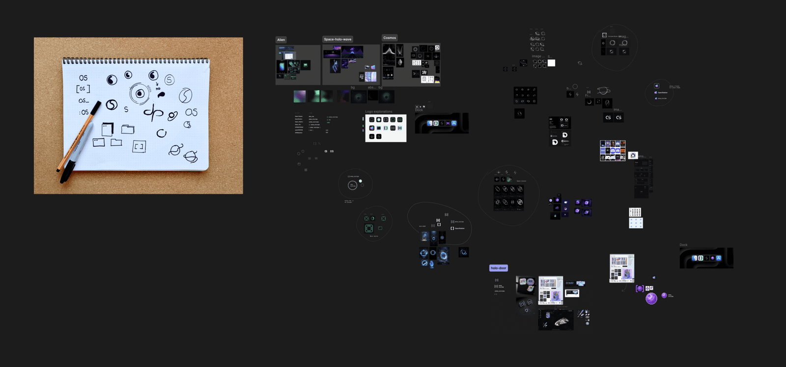
I started where I always start, which is paper. Advanced technology.
Ugly little drawings, lines, the same shape drawn thirteen times… Then a couple (or a hundred) of hours on Pinterest saving anything that sparkled in my eyes, and a Figma board where I dumped it all and started grouping.

And then, I started feeding the machines.
I dumped my chaos to AI: a sketch, a color, a screenshot, a note that said not this, more the other (which is apparently a valid prompt now). It came back with fifteen things, half of them wrong. That wrongness sent me back to the board. I drew again. I fed it again. AI → Figma → Pinterest → AI → Figma… and repeat.
This, for three days.
Locking the concept: Spaceholowave
Don’t search for that because I invented it.
It’s a mix between Space + Holodoor + Synthwave. I kinda wanted to play with some holographic and vibrant elements, Cyberpunk style, floating on the dark void.

I was also obsessed with one reference: the holo-door from NMS.
I won’t go into the details of why I know this game or how many hours I spent playing it, but I also will add that on top of that visual reference, I had the Stargate door and Dragon Ball capsules.
You see where I’m going with this, right? Forcing all my nerd references into something that had to make sense.
The logo + Mio
Is it a holo window? A helmet? A candy? A marble? Yes. Or no. You decide, honestly, I’ve stopped thinking at this point.
What I knew was that the O and the S had to live inside the same shape, so it went through a lot of shapes until it became this:

I don’t know if Mio came before the logo or after. I think they happened to each other, actually.
But basically, the mark has two shapes: the ring, and the curve carved out of it, which looks like a blob. That’s Mio. Our station resident. He’s the logo’s negative space and turned into a small ghost that glows, making your space a tad more lively.


Designing Mio is probably one of the most fun things I’ve done in my adult years. 
Merchandise makes things real
Logo and Mio in hand, I let the AI go bananas on merchandise. Holographic stickers, enamel pins, the works. We didn’t need stickers on day two. But nothing tells you whether a brand holds up like seeing it on a pin the size of a one-euro coin. If it survives that, it survives a favicon.

And little by little the brand was forming.
The types are Geist and Geist Mono: open source, Vercel did a lovely job with them, and they sit right where we live, somewhere between space and a terminal.
Colors were obvious: holo pink over the void. Something that stands out on a dark screen and, big point here, stays accessible.

The brand is alive
Three days of brand sprint saved us weeks of “should this be rounder” conversations.
Not because the brand is perfect. Because the brand guideline is alive, public, and hooked into the agents we use, so anyone on the team can make a wallpaper or a widget icon and it comes out looking like part of one big happy Mio family.
Go poke at it yourself:
Thank you for reading this messy post and big shoutout to Nick Hamze, who showed up at WCUS with these amazing shoes: